Page 2 of 2
Re: [PR] March Mayhem!
Posted: Thu Apr 04, 2013 3:04 pm
by Bizze
I love the sunburst-like arrangement of the swords!
In fact, I think it's a step up from our current logo. It says more "Radiance" and less "Wheel". (No offence to anybody who has created our logo of course). I would love to see a stylized version like the one in the forum header above, but with the sunburst effect, just to see how it looks...
Re: [PR] March Mayhem!
Posted: Fri Apr 05, 2013 12:29 am
by Treylar93
@Bizze ...
You mean something like this? I had to "create" some room between the hilts to ... ok, it still looks a bit like the wheel of a mast ship. g'Arrr!

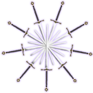
- 9swords_135x135.png (30.6 KiB) Viewed 4319 times
@Katelin ...
Ok, great I will continue with the ones that I have planned so far ... is there a better spot on the forums for the advert-banners? Also, I have plenty of room to host these, but I would rather they were hosted on the cabal site.
Re: [PR] March Mayhem!
Posted: Fri Apr 05, 2013 12:02 pm
by Bizze
@Treylar: I was mostly thinking about the pure white swords (line art logo). I think maybe the handles of the swords are a bit too big in comparison to the blades.
Everyone's a critic, I know... ^_^
Re: [PR] March Mayhem!
Posted: Fri Apr 05, 2013 4:41 pm
by Katelin
Thats because they are stretched daggers.
Re: [PR] March Mayhem!
Posted: Sat Apr 06, 2013 1:05 am
by Treylar93
You both are right ... the blades need to go past the hilts to retain the "radiance" look , and the blades look like stretched daggers.
I noticed the latter once I singled out the blade & hilt layers from the Templar cross, but I wanted to get other thoughts too.
Right now, I am looking at using the claymore blade that I used my signature below instead of the blade that goes with that hilt ... originally, the image came from
http://www.nihilogic.dk/labs/tswweapons/view.html ... look for the "Medieval Sword 2" in the Blade section.
Actually, the more I think about using the claymore blade ... the more I like what I see in my head. The proportions, the shadow effect, the sharp pointy tip ...

...
be-right-back!
*Runs off*
Re: [PR] March Mayhem!
Posted: Sat Apr 06, 2013 5:19 pm
by Treylar93
*runs back*
This should look a lot better.
Re: [PR] March Mayhem!
Posted: Sat Apr 06, 2013 5:43 pm
by Katelin
It just doesn't look like 9, though I like the sword shape

Re: [PR] March Mayhem!
Posted: Sun Apr 07, 2013 3:26 pm
by Treylar93
Does having the white color overlay turned off help?
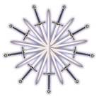
- 9swordsColor_140x140.png (31.01 KiB) Viewed 4305 times